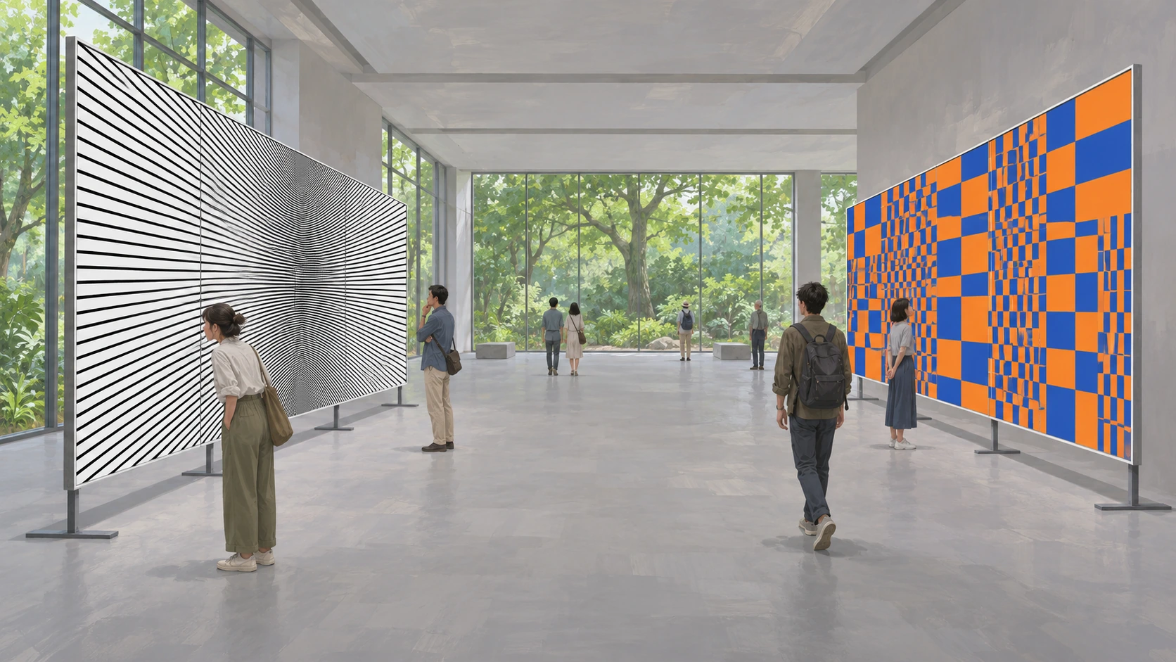
77Op Art / Optical Art
Use geometry, color and repetition to create apparent depth, vibration or visual instability on flat surfaces.
Definition and context
Op Art explores geometric forms, color and visual perception; static images can suggest swelling, depth or vibration. V&A prints, studies and textiles offer comparisons of line density, neighboring colors and figure–ground relationships. The category is neither every optical illusion nor only black-and-white stripes: different works can pose different perceptual questions.
People and ecology
People approaching, retreating or moving sideways can reveal a pattern under different viewing conditions without distorting their bodies. Real plants beside geometric surfaces also provide contours and scale, keeping natural objects distinct from flat visual effects.
Spaces and forms
Choose one controllable relationship: changing line spacing, repeated units, size variation, color adjacency or figure–ground reversal. A clear local change makes comparison possible. Arbitrarily accumulating dense lines does not automatically create a structured perceptual experiment.
Color and materials
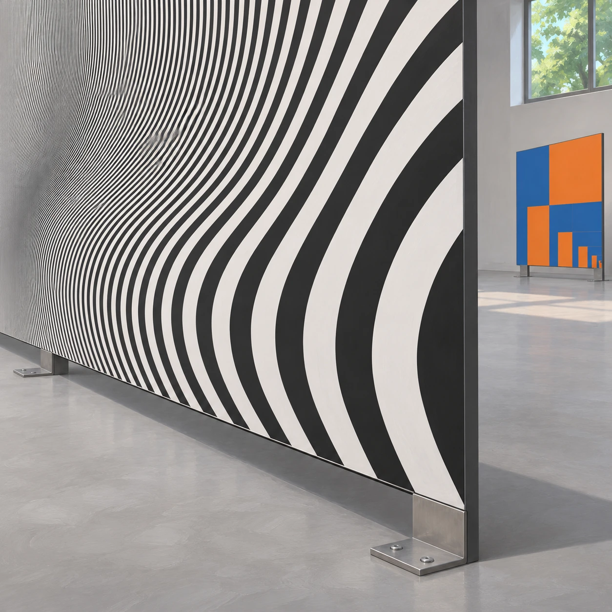
Prints, textiles, painted panels and transparent layers can carry patterns while physical thickness remains distinct from visual depth. Edges, stands and joints reveal the support's structure even when a pattern seems to bulge. Actual three-dimensional relief should not simply replace an effect intended to arise from flat relationships.
Light, composition and scale
Black-and-white contrast, neighboring hues and complements offer different results, with effects judged in actual combinations. Even light helps compare patterns; local shadows can explain panel thickness. Broad stable color fields clarify local changes within dense graphics.
Sound and graphics
Viewers can change distance, angle or the relative position of layers, comparing apparent and actual movement. Stationary patterns can retain exploratory value. Quiet plain routes and clear entrances keep attention on graphics instead of making the whole environment directionless.
Motifs and distinctions
Compared with psychedelic art, the emphasis often falls on explicit geometric and perceptual relationships rather than figurative fantasy. Compared with impossible architecture, the focus is on perceptual effects created by graphic relationships, without necessarily producing a spatial paradox. Op and kinetic art overlap, but physical movement is not required in every work.
Ideas for game environments
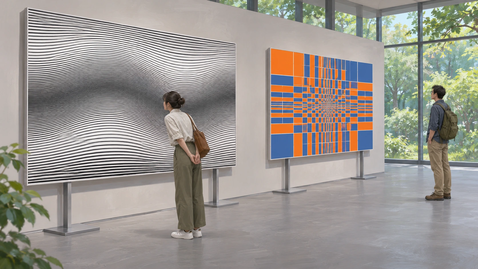
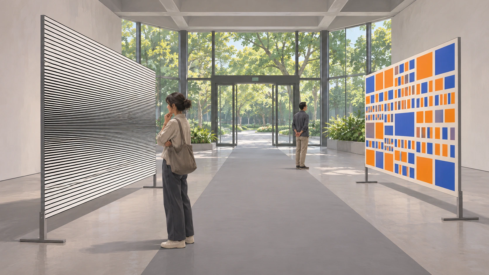
Design a perception gallery. Black-and-white line spacing changes across one flat panel, while blue-orange rectangles compare color adjacency on another; edges and stands reveal that both remain flat. Ordinary visitors vary their distance along quiet gray paving, with real plants outside providing scale. A few rules create viewing relationships open to comparison.
Read scene descriptions
Main environment
An original perception gallery sets up two comparisons: changing black-and-white line spacing and neighboring blue-orange rectangles. Panel edges and stands reveal physical flatness while ordinary visitors vary viewing distance along quiet gray paving, with outdoor plants and plain walls providing scale and open space.
People vary viewing distance while the pattern remains stationary and physically flat.
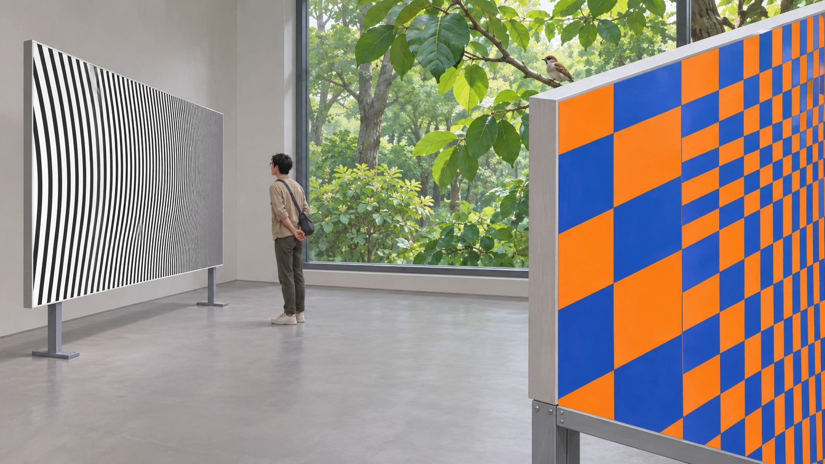
Real plants provide natural contours distinct from geometric graphics.
Edges, joints and stands reveal a physical plane while graphics suggest visual depth.
A quiet route joins two comparison areas, keeping graphic rules and spatial direction legible.